Porta
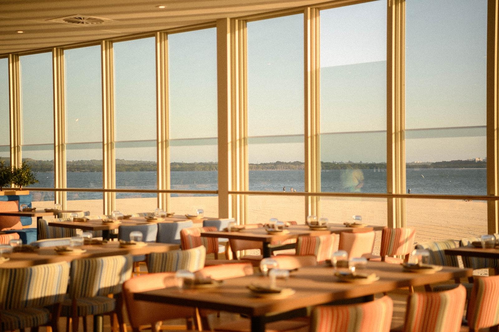
A Mediterranean restaurant with waterfront views located within the George’s River Sailing Club.
Porta is a place to retreat, where stories spill as easily as the pour, the wine arrives before the decision does, and conversations flow into the night. Whether you’re there for a long lunch with family, cocktails with friends, or a sunset dinner by the bay, Porta makes every visit relaxed, easy, and unforgettable.
Scope
-
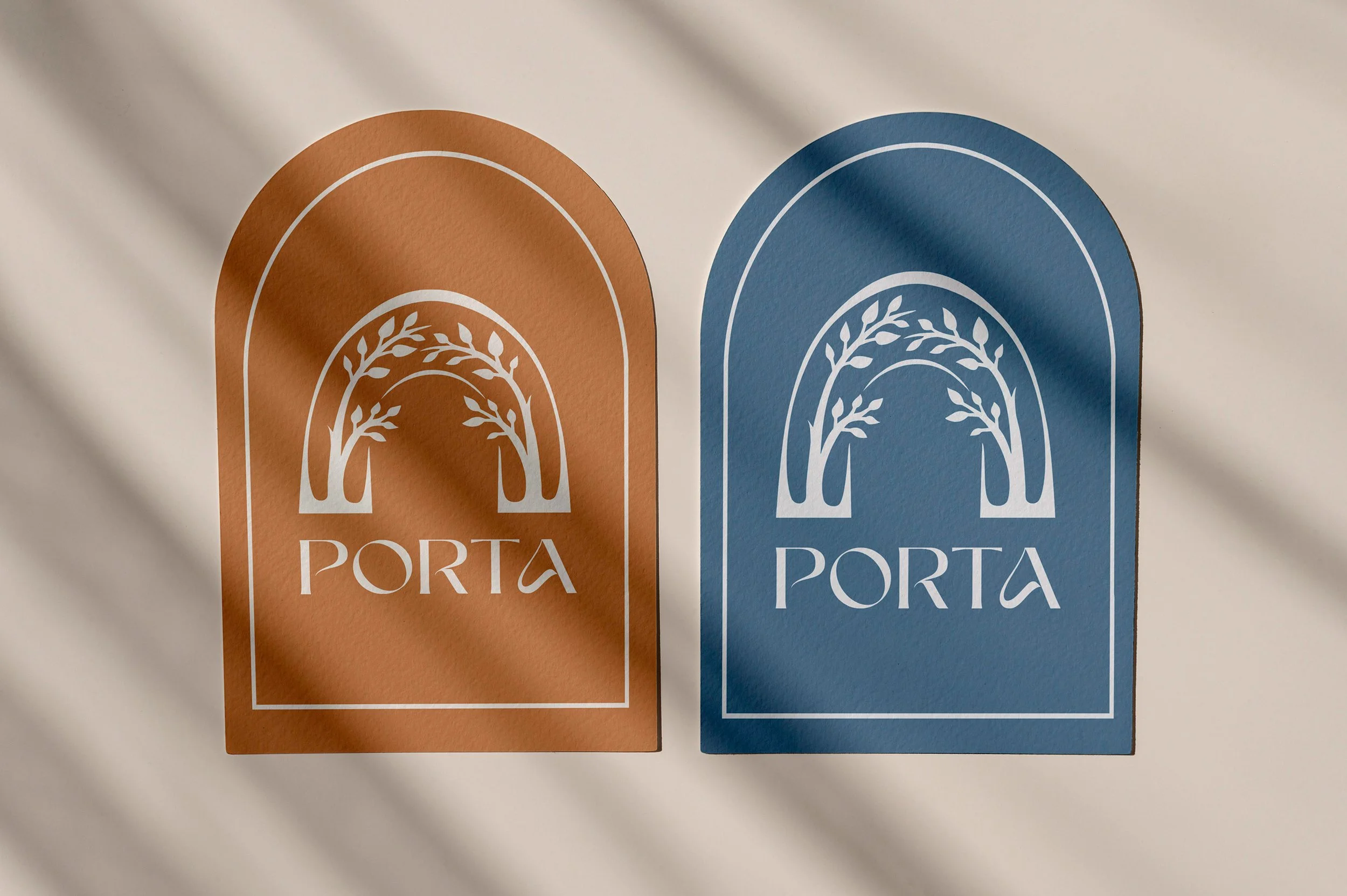
Logo, Brand Guidelines, Photography Styling Guide
-
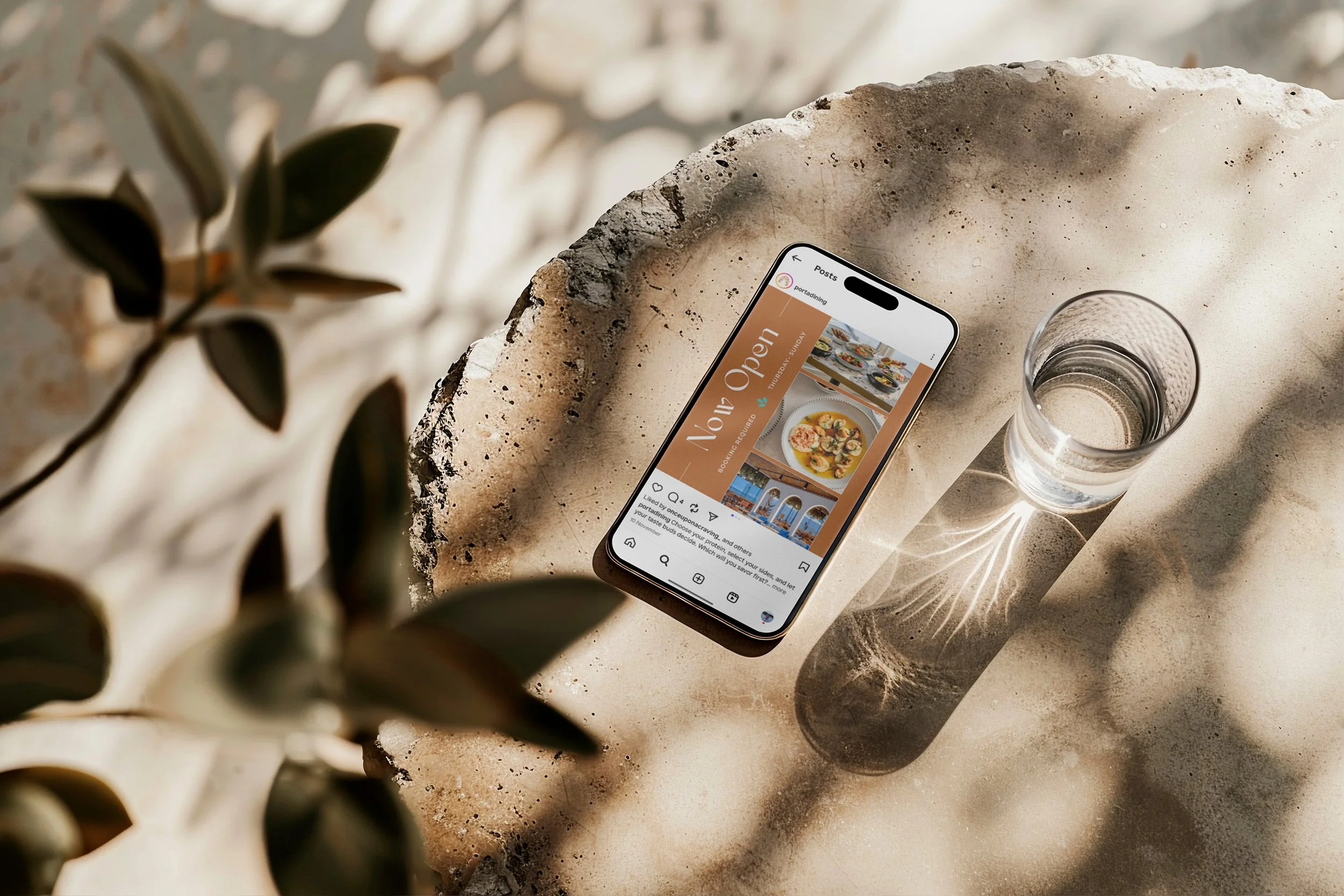
Venue Name, Brand Persona, Tone of Voice Guidelines, Messaging Pillars, Website Copy
-
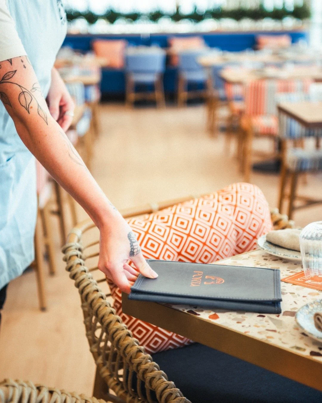
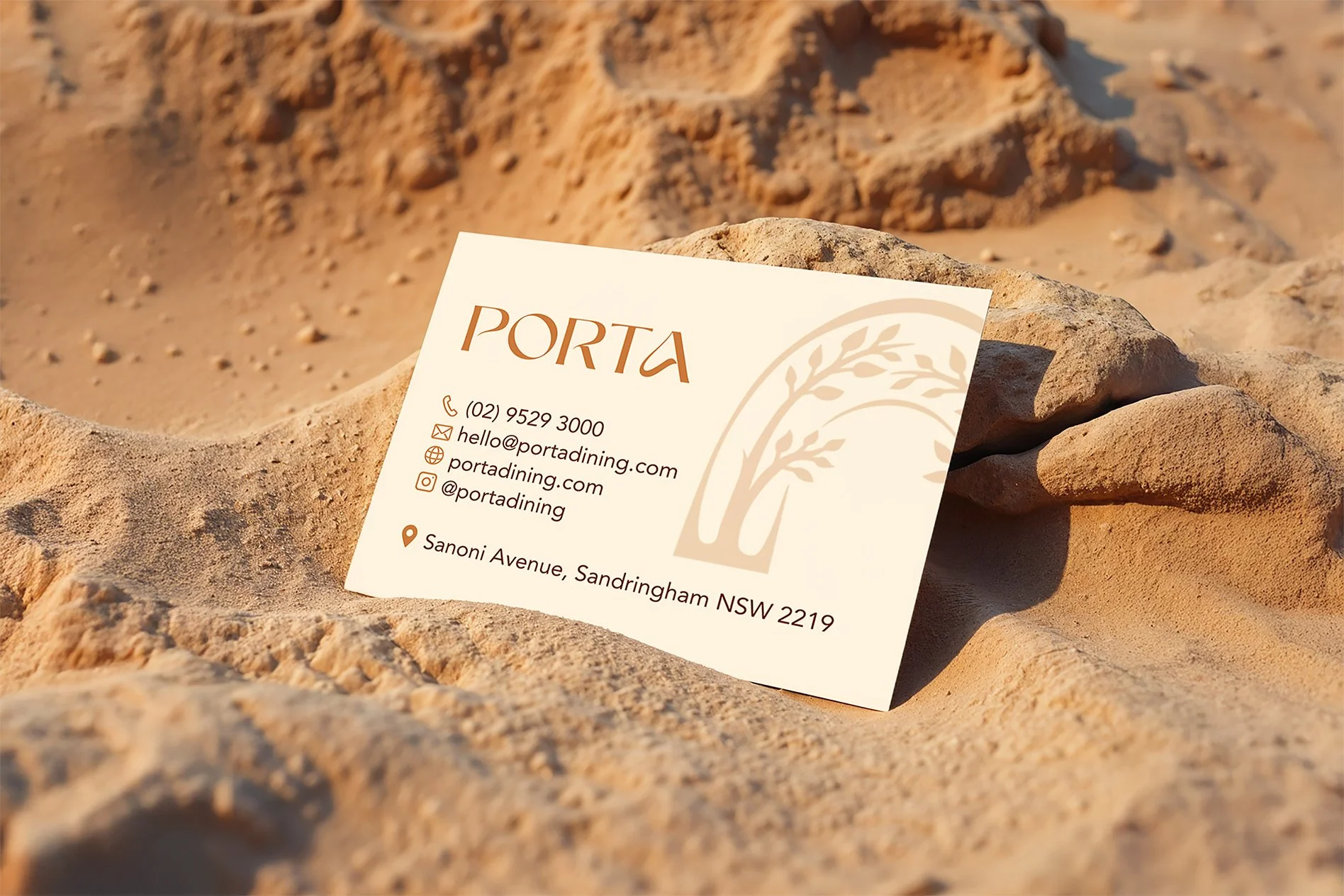
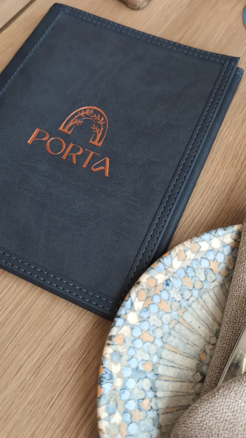
Menu Design, Coaster Design, Business Cards
-
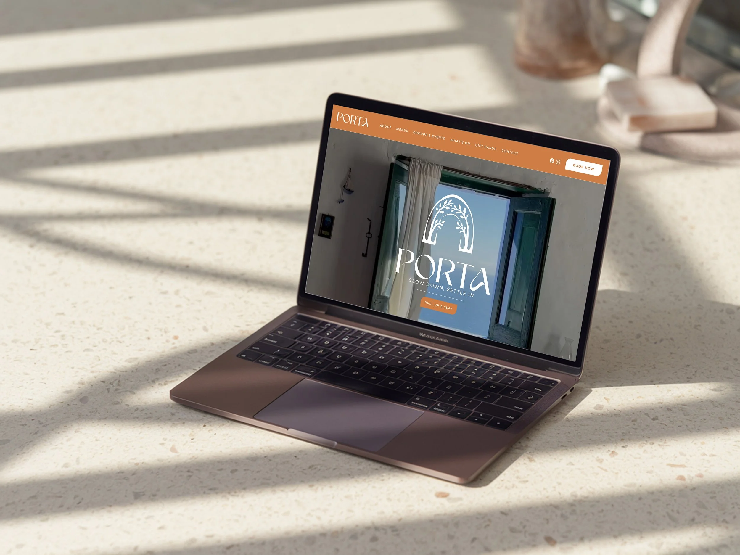
Design & Build of multi-page Wordpress website.
Our Vision
Porta’s visual brand identity is inspired by easy Mediterranean coastal dining, capturing a sense of warmth, simplicity and laid-back elegance. The colour palette leans into sun-washed tones and natural hues that reflect the waterfront setting and the feeling of long lunches, shared plates and unhurried time spent by the water.
This relaxed energy is supported by natural textures and subtle finishes that add depth without feeling overworked. Paper stocks, gentle grain and lightly worn details help the brand feel authentic and welcoming rather than overly polished.
Typography keeps things clean and approachable. Clear, contemporary fonts make the brand easy to engage with, while softer spacing and details add a calm, coastal rhythm. Together, these elements position Porta as an inviting Mediterranean destination that feels familiar, considered and effortlessly enjoyable.

